

August 23, 2020
Top 7 Product Page Design Tips For Your Online Store

Top 7 Product Page Design Tips For Your Online Store
Impeccable UX and UI are vital for every eCommerce website. Therefore, when it comes to the pages that showcase your products, it’s your chance to stand out and win clients over. Although it is a challenging task, surprisingly even the page layout choice can play a more important role than one might think at first. In any case, you should aim at making your products look appealing to your customers, give them all the needed information on the item, and persuade them to make the purchase.
On this page, we’ll gladly share recommendations on which design solutions to consider for your product pages and explain them on cases of famous brands. Make sure to share them with the designers who’re working on your site!
Before jumping over to the tips shown on examples, let’s dot the “I’s” regarding why the product pages of your website are crucial and which page elements they should ideally include.
For starters, product pages are the very place where you have a chance to show to the best advantage the things that you sell. The main goal of such pages is to represent the product or service that is on sale in the most alluring way possible in order to urge the potential client (who could even be simply browsing) to buy it and become your customer.
That said, the main product page elements that are worth additional attention include:
Now it’s high time to introduce you to the design solutions that were selected by world-famous brands for their online retail store’s product pages. Let’s begin!
As they say, there’s a lot of beauty in simplicity. Opening our list of product page examples is that of the official Diesel website.
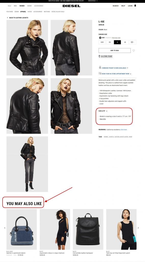
The first thing that we can see in the screenshot of the biker jacket is the large gallery images to the left. The massive pictures catch the user’s eye immediately, and they are placed separately as opposed to the habitual carousel-style. There are many gallery layouts, of course, but many brands, including Armani and Chanel, are using such gallery placement like Diesel.
Product close-ups are a great feature to jot down as well. Either it’s a zoom available right on the gallery or if it’s a pop-up, giving customers the chance to see the smallest details of the product up close is highly important as they can’t look at them in reality, only from their screen. Some brands even prefer to add videos with the product to the gallery section too.
It goes without saying that your pictures should be of the ultimate best quality. Yet don’t forget about image optimization and compress them in size so that they won’t slow down your page load time.
What is more, note that Diesel carefully puts all the product details to the right of the gallery in a single column with an accent made on minimalist black and white elements.
The major point that of the Diesel product page to be noted is the “You may also like” section. Personalized product selections are a fantastic way to not only upsell other compatible or similar products available on your store, but it is also an outstanding tactic used by many brands around the globe to prove to your customers that you know their tastes. As opposed to showing all of your shoppers the same things, with the use of AI, it is possible to pitch items that this very shopper may be into on the basis of their previous searches and purchases.
Without a doubt, the official Maybelline New York website has some great design ideas on their product page to take a look at too.
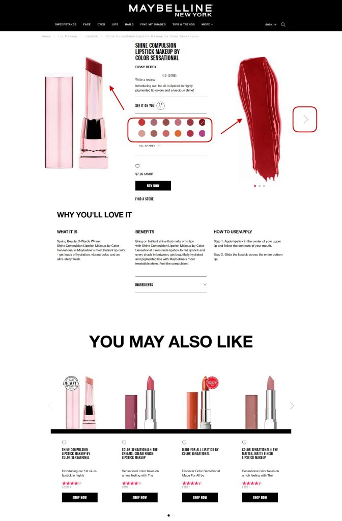
First of all, it must be mentioned that the untypical layout of the page already deserves some attention. Take a look at how the product gallery is split in half and the short product details are placed in the middle (with the name of the product, its price, rating, and shop button with a CTA).
Below that, Maybelline gives a more comprehensive explanation of the benefits of the product and how to use it. Again, here we can also see personalization in the large “You may also like” section that’s followed by a massive block with client reviews.
But one of the major reasons why the Maybelline New York product page made this tips list is because of their interesting “move” with displaying the various shades their products come in.
When clicking on any of the colors of the shades palette in the central part, the colors of the lipstick change in both galleries (the left one with the lipstick bullet and the right one with the lipstick dab). What is more, the arrow slider on the right allows you to flip through a couple of more pictures of the product.
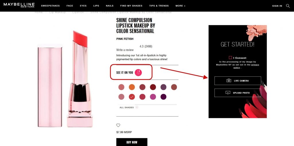
Adapting augmented reality functionality is yet another hit to truly not miss out on! With the help of mobile device cameras (similarly to the way face mask apps work), such a feature that Maybelline New York uses gives people the opportunity to see how this or that shade can look on them in real-time without physically applying the makeup.
This technology might be a bit costly, yet it works really well for various types of goods apart from cosmetics and beauty products (i.e., glasses, footwear, accessories, even sofas, to give a few examples).
Another rather reserved product page case that’s great in its simplicity is that of the official Reebok website. There’s a standard gallery with product zooms and a professional video showing the shoes. All of the short information is carefully put to the right of the gallery with useful sections such as the size guide and color options. Plus, the “Highlights” block showcasing the unique strong points and features of the product is useful and looks stylish.
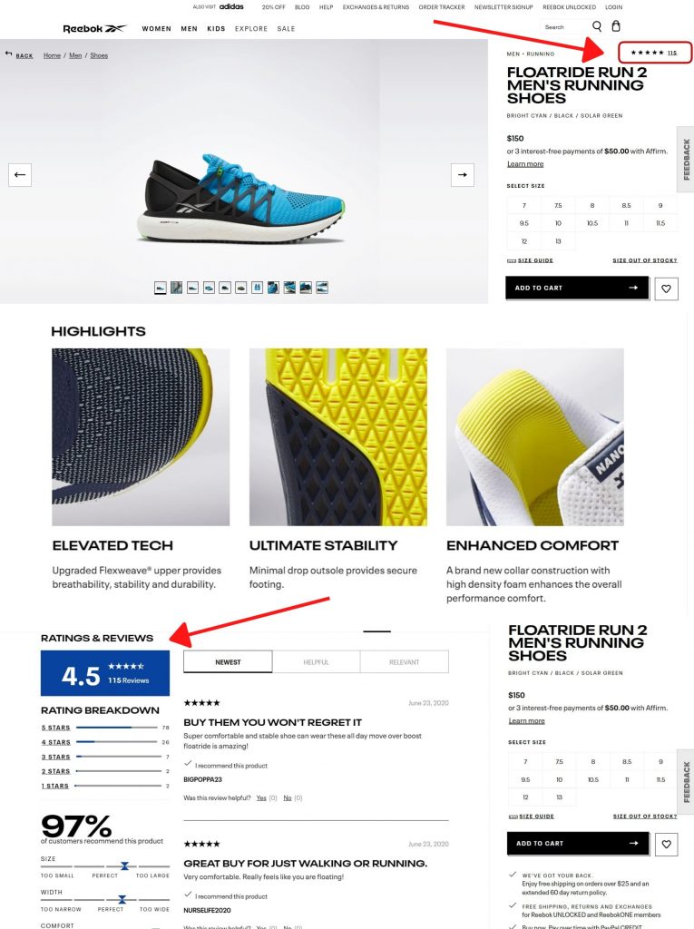
Importantly, Reebok is listed among the examples as the page has an imposing client reviews section. Such feedback left by actual clients who have already purchased the product brings immense value to those who are only planning to buy it. Opinions of people who hold the product and can evaluate it’s strong/weak points that other shoppers can pay attention to.
When clicking on the star rating at the top of the Reebok product page, it takes you down to the block with reviews. The reviews can then be filtered. A wonderful idea here is the given reviews recap with the percentage of customers who recommend the product and the scales that rate the shoe in terms of fit (size, width, comfort, etc).
The bottom line here is don’t underestimate the power of product evaluation by previous clients, such an element should ideally make it to the product page at least for credibility reasons.
You can easily improve client satisfaction by granting people all the information that they need about the product. No more and no less. Here’s a screenshot from the official Ray-Ban website that can help prove the point.
The page is fitted with many elements yet all key ones are present. As such, we can see the sliding gallery, the virtual try-on function, the variations that the glasses can come in, the price section, a “Complete your order” block for upselling glasses cases, a personalization block (“You may also like”), and an extensive reviews section.
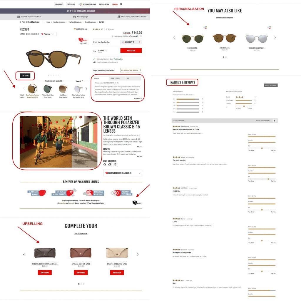
Apart from that, Ray-Ban is a nice case to take a look at due to their descriptions of products. The texts aren’t too long, there are elements of wordplay, catchy phrasing, and intrigue. For instance, one of their descriptions of sunglasses states: “What do you get when you cross a circle with a square? You get the hexagonal RB 3548N, the evolution of round featuring flat crystal lenses.”
Noting the strong sides, their descriptions are kept short, there’s no unneeded space-filling, all words bring value. Furthermore, Ray-Ban splits the description from the details in separate tabs (Details, Frame \ Lenses, Size) for faster data allocation and convenience.
Plus, just as in the previous Reebok case with item “Highlights”, Ray-Ban manages to demonstrate the benefits of polarized lenses. A curious feature here is the sliding shades block that engages users to see how the world can be viewed when wearing and not wearing the glasses. Plus, the major strengths of the lenses are listed via icons and short texts.
Finally, let’s take a look at the official Pandora website. Noted for their effective use of colors and a recognizable style across many channels, Pandora does a great job with not only presenting products on separate pages but also selling them using social media.
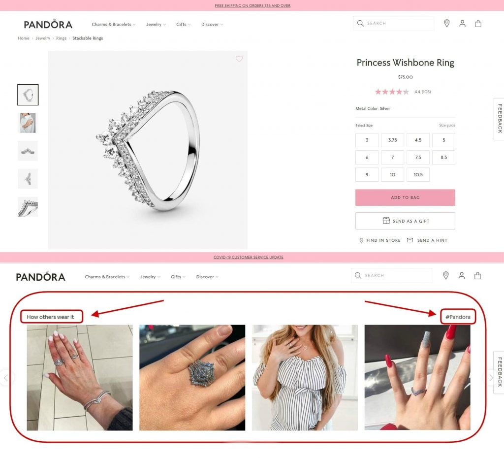
A neat thing to show on product pages is how other people enjoy it and use it. By inviting customers to share pictures wearing or using the product and placing a corresponding hashtag on social media channels, such as Instagram, is a wonderful way to engage users. The best pictures can be featured on the website (which makes people happy), more post shares bring your brand additional online presence and basically free “word-of-mouth” advertising, and, to top that, help to persuade clients to buy the item from your homepage. Seems like a win-win for everyone!
Summing up, product pages can to some extent be called the nucleus of an eCommerce website. This is what the customers came here for, this is what they want to buy. Therefore, this is the place where your communication with customers and the presentation of the items on sale should be done to the best of your ability. Hopefully, these recommendations gave you a few ideas of what to implement on your online retail store and will help you solve many challenging product page design problems.
—
Alex Husar
Alex Husar, CTO at Onilab with 8+ years of experience in Salesforce development services and Magento. He graduated from the Czech Technical University and obtained a bachelor’s degree in Computer Software Engineering. Alex’s expertise includes both full-stack dev skills and a strong ability to provide project-critical guidance to the whole team.
5 Ecommerce Trends to Leverage for the New Normal in Retail
Review posted[…] trying to secure a foothold in ecommerce is that we are now in a multichannel world. A proprietary ecommerce storefront that’s fully optimized for growth is a complement to a presence on multiple marketplaces. Any brand that wants to succeed […]